
 Image Credit: ©Vicky Design via Canva.com
You must have heard of TailwindCSS, the big, awesome thing that seems to have finally become a standard in the Cascading Style Sheet(CSS) world. Chances are that you have used it - if no, then(in my opinion), you've been missing out - a lot.
In this detailed piece, I trace the journey and key developments that positioned Tailwind CSS as a leading force in the frontend development landscape.
By examining the evolution of web styling approaches and technical shifts in the industry(through the lens of my engineering experience over the years), this article highlights the pivotal moments that created the environment where Tailwind's utility-first methodology could flourish and gain widespread adoption.
To make things all perfect, I'll be sharing extremely valuable code samples and screenshots along the way. I'll also be sharing some awesome features of Tailwind - showing you real reasons why hating it is simply a bad idea.
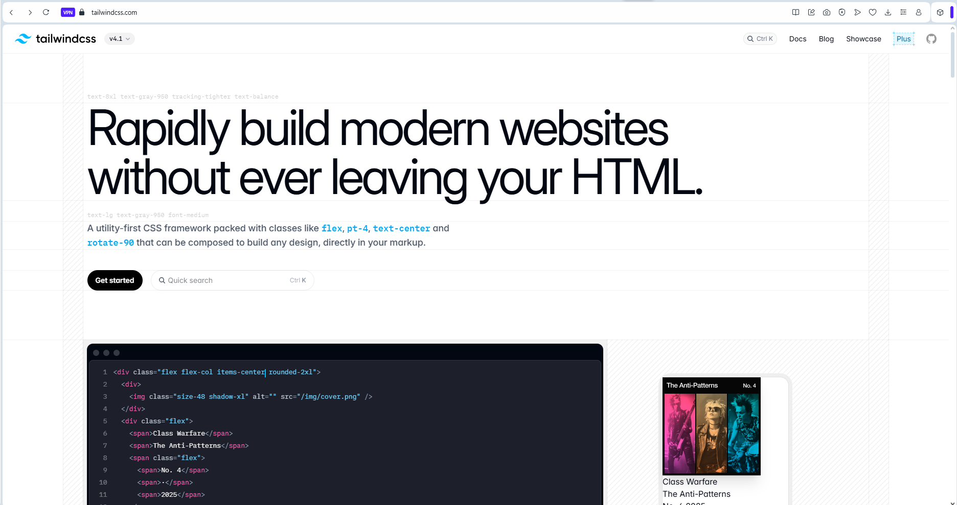 Image: a screenshot showing a section from the
tailwindcss website landing page.
Image: a screenshot showing a section from the
tailwindcss website landing page.
The software development world is characterized by fast-paced innovations that lead to constant change, all in a bid to make lives better for software engineers. Many times, a lot of these innovations come and go - passing only as trends.
Yet, some stay on - stamping their awesomeness - and becoming industry standards.
Tailwind is one of such!
CSS Over The Years - My Journey.
It's been about half a decade or more, since I first wrote CSS. I remember the early days of my obsessive passion for coding. It was fascinating, and beautiful.
The Days Of Bootstrap.
Fast forward a while, and I was building interfaces with Bootstrap.
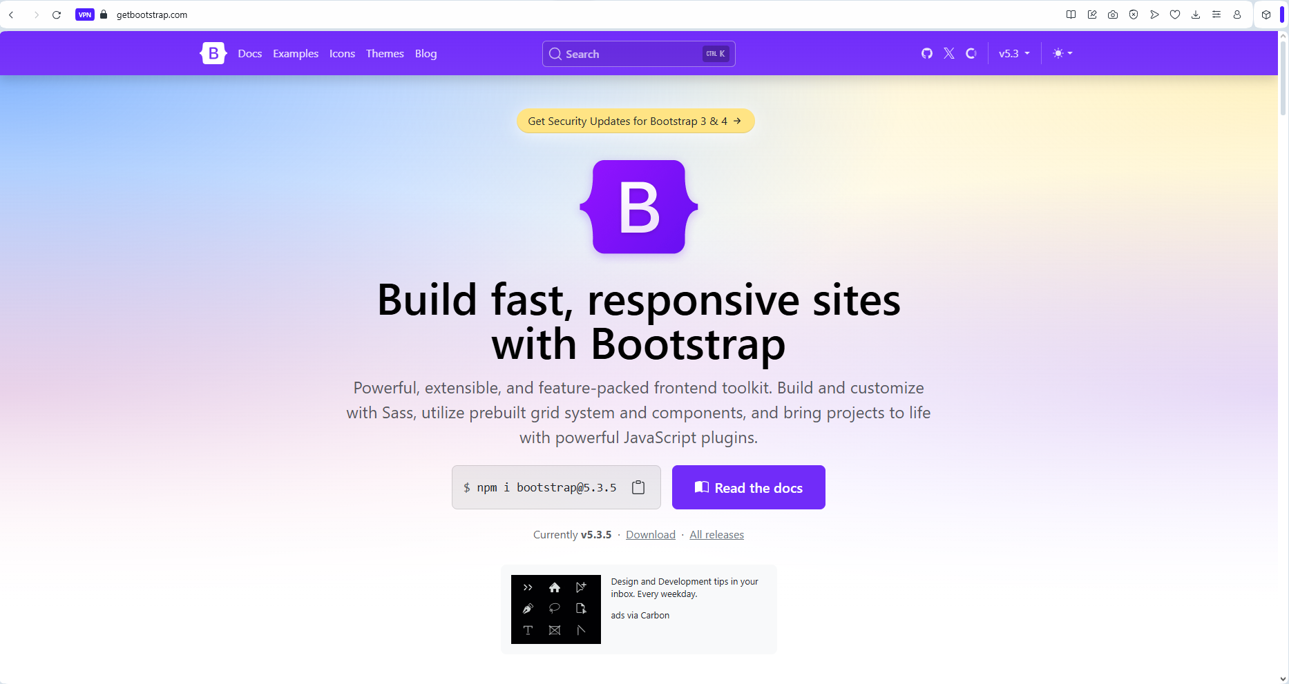 Image: a screenshot showing a section from the bootstrap
website landing page.
Image: a screenshot showing a section from the bootstrap
website landing page.
Bootstrap was awesome - it saved lives in its prime, Its grid system(back then) was truly revolutionary. But one major complaint kept hitting hard on it - it produced interfaces that looked very similar. This flaw was simply because Bootstrap was not just a CSS library or framework. It was a complete(HTML, CSS, and Javascript) package for building interfaces. As a UI Library, its components were neat, and beautiful. They gave you so much power, but with the temptation to just copy-paste them, came other issues.
With Bootstrap, developers seemed to get locked in - (my opinion), barely seeing the need to customize further, thereby delivering interfaces that look similar.
With copy-pasting Bootstrap components(or simply using provided classes), also came the need to overwrite its CSS classes to obtain more unique UI looks. Overwriting CSS classes was not all that easy. It often led to messy specificity bottlenecks, and other issues.
With Bootstrap, I still often had to write custom CSS code. This was not always very convenient, but there was always going to be a way around.
Bootstrap was not the only front-end UI library around, there were quite a number of them(Material UI, Chakra UI, Bulma, and more - which I didn't, or barely used). But over the years, the problem seemed to be, that these libraries just couldn't figure out the perfect way to provide the one thing that UI engineering needed most - a highly FLEXIBLE design system that simply got it right.
Aside from the issues with Bootstrap that I've already discussed, there were other reported issues with Bootstrap which I never really bothered about back then - I guess due to my experience level.
-
Bootstrap presented other significant challenges. Its file size was substantial, leading to slower page loads, especially on mobile devices or in regions with limited bandwidth. Even with the ability to select only specific components during installation, many projects ended up shipping with unused CSS and JavaScript - which was a significant drawback.
-
Version updates were another pain point. Upgrading from Bootstrap 3 to 4, for example, required significant refactoring, as class names and behaviors changed substantially. This created technical debt for long-running projects and made maintenance more challenging.
Bootstrap was great, but it just wasn't it!!!
CSS Preprocessors.
With little or no choice but to write custom CSS(even with Bootstrap), coupled with my constant itch for growth and keeping up with trends, I upgraded from writing vanilla/raw CSS to using a CSS preprocessor - Sass(Syntactically Awesome Style Sheets).
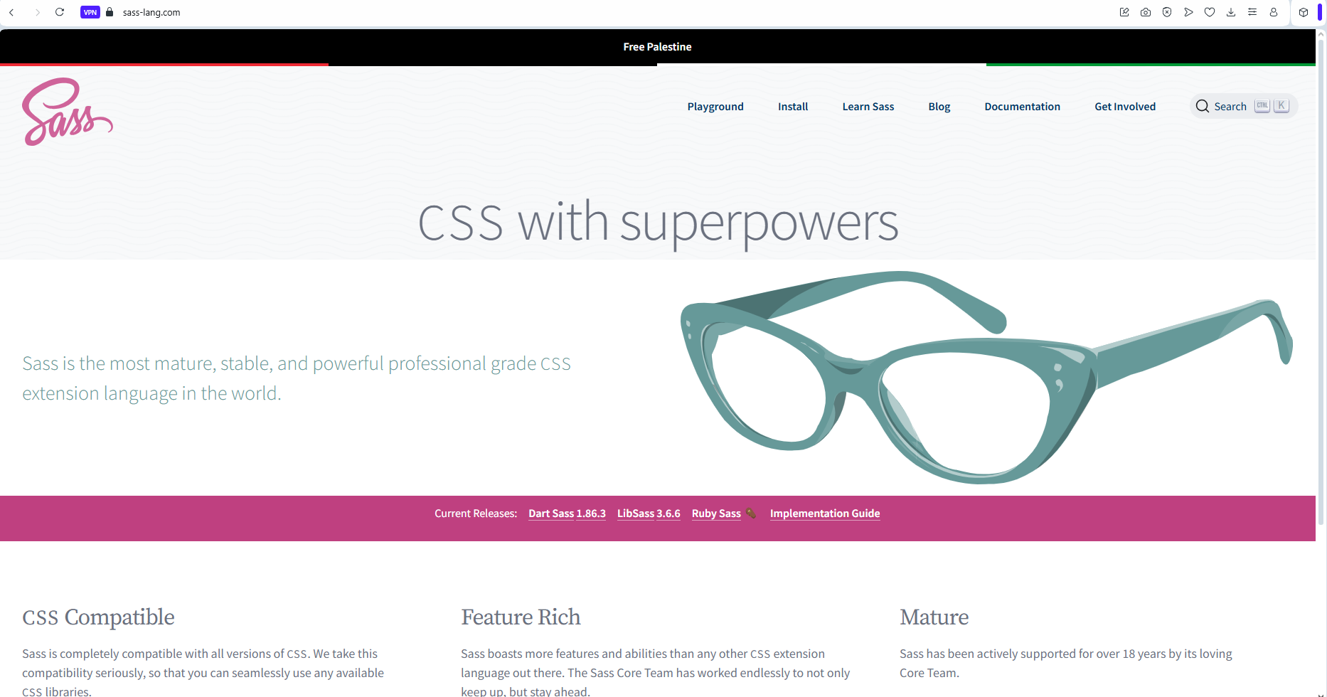 Image: a screenshot showing a section from the sass
website landing page.
Image: a screenshot showing a section from the sass
website landing page.
CSS preprocessors are scripting languages that extend the capabilities of standard CSS. They add features like variables, nesting, mixins, functions, imports, and mathematical operations that make CSS more maintainable, reusable, and organized. They produce code that compiles into regular CSS that browsers can understand.
Created in 2006, Sass is one of the most popular CSS preprocessors. A quite popular alternative to Sass is Less.
Key Features of Sass.
Sass is mind-blowing. It provides a CSS experience that can simply be described as 'being on steroids'.
Below are some awesome features that Sass provides, with - real code screenshots from one of my old(ReactJs) project.
1. Variables(even though CSS later caught up with this): Sass enables you to store values for reuse throughout your stylesheet.
1
2  $primary-color: #3498db;
3  $font-stack: Helvetica, sans-serif;
4
5  body {
6    color: $primary-color;
7    font-family: $font-stack;
8  }
9
10
2. Nesting: Sass makes writing cleaner CSS possible, it enables you to write nested CSS that mirrors the HTML structure. Just beautiful right?
1
2  nav {
3    background: #333;
4
5    ul {
6      margin: 0;
7      padding: 0;
8
9      li {
10        display: inline-block;
11
12        a {
13          color: white;
14          &:hover {
15            text-decoration: underline;
16          }
17        }
18      }
19    }
20  }
21
3. Mixins: Mixins are Sass' special way of enabling you create reusable chunks of CSS.
1
2 @mixin border-radius($radius) {
3 -webkit-border-radius: $radius;
4 -moz-border-radius: $radius;
5 border-radius: $radius;
6 }
7
8 .box {
9 @include border-radius(10px);
10 }
11
12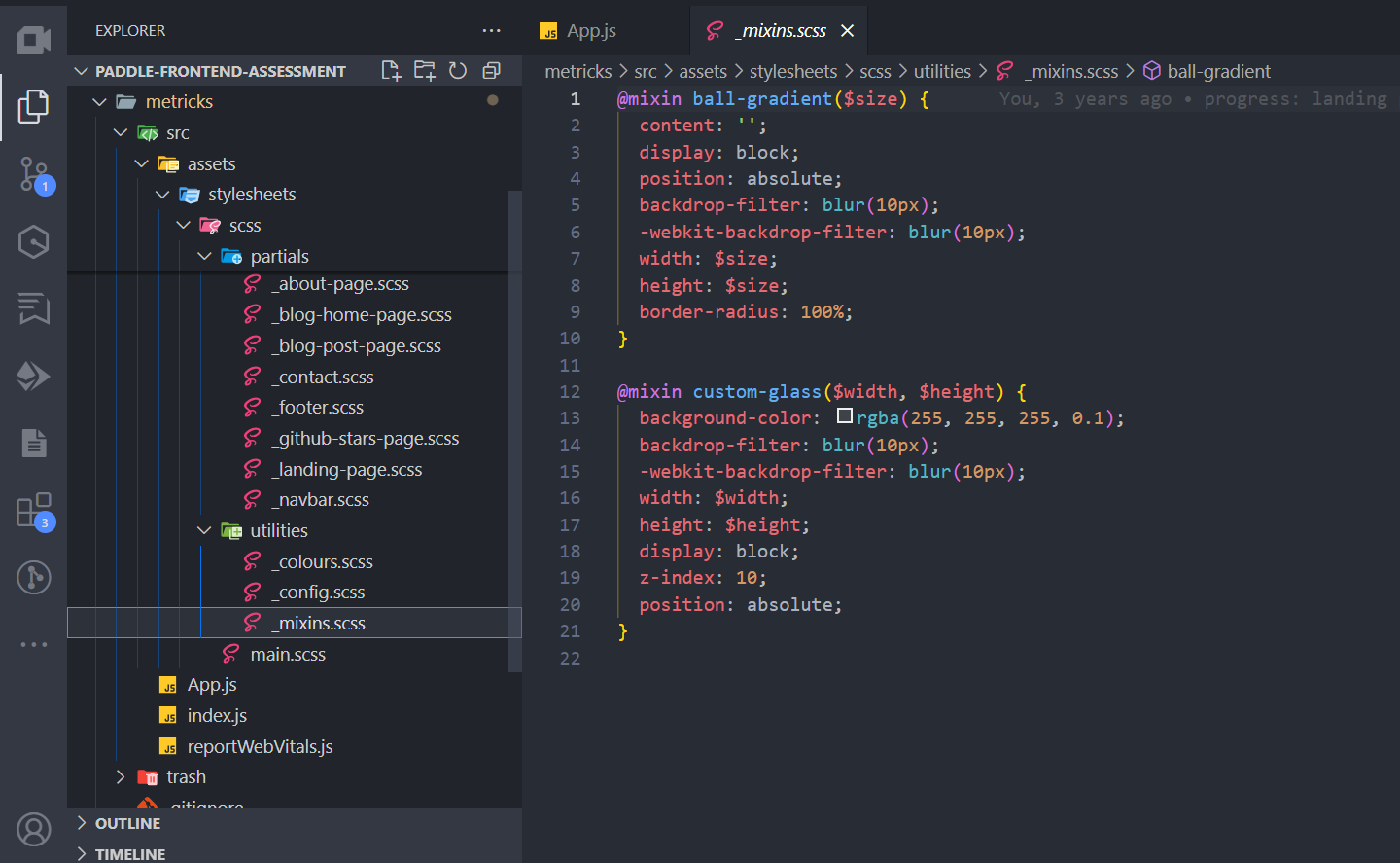 Image: a screenshot showing sass mixin declarations.
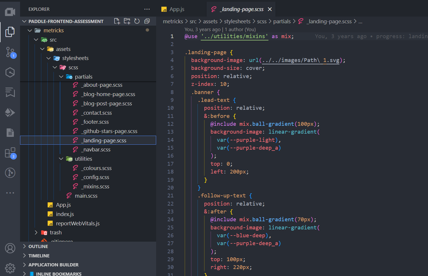 Image: a screenshot showing mixin import and use.
4. Functions: Yeah! and this too. Sass enables you to perform calculations and return values.
1
2 @function calculate-width($col-span) {
3    @return $col-span * (100% / 12);
4  }
5
6  .sidebar {
7    width: calculate-width(4); // Returns 33.33%
8  }
9
10
5. Partials and Imports: This would probably be the best feature of Sass. It allows you to split CSS into smaller files and import them.
1
2 // _reset.scss
3  * {
4    margin: 0;
5    padding: 0;
6  }
7
Then import and use.
1
2 // main.scss
3 @use 'reset';
4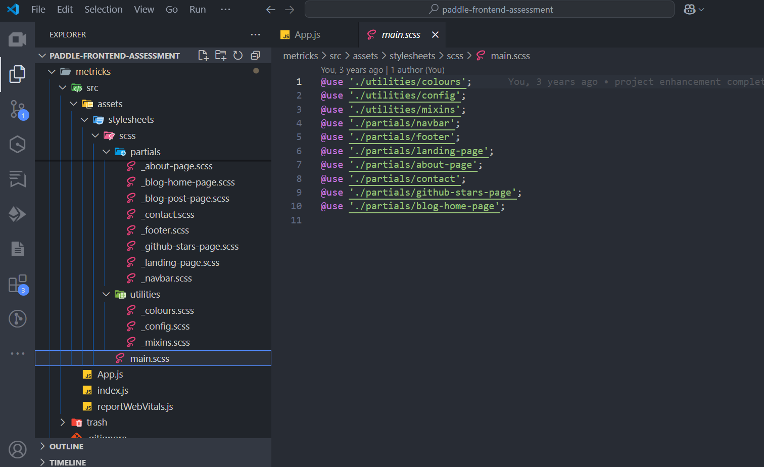 Image: a screenshot showing sass imports.
6. Inheritance: Sass also gives you the power to share CSS properties between selectors.
1
2// This CSS will print because %button-base is extended.
3%button-base {
4  padding: 10px 15px;
5  border: none;
6  border-radius: 5px;
7}
8
9// This CSS won't print because %equal-heights is never extended.
10%equal-heights {
11  display: flex;
12  flex-wrap: wrap;
13}
14
15.primary-button {
16@extend %button-base;
17background: blue;
18}
19
20.secondary-button {
21@extend %button-base;
22background: gray;
23}
24
Writing this article, I must confess to this feeling I'm having. I think to say that I honestly miss writing Sass 🤓.
Sass is simply fascinating.
Sass Workflow Benefits
Sass provided quite a number of impressive work-flow benefits. It offers some very significant advantages which can easily be seen from the screenshots and code samples shared above.
- Modularity: It breaks stylesheets into logical, manageable components.
- Maintainability: Sass variables make global changes easier and prevent CSS duplication.
- Efficiency: It empowered you to write less code mixins, extend, and very importantly - through nesting.
- Organization: Sass enabled you to structure CSS in a more consistent, hierarchical way.
Sass Implementations
Sass comes in two syntax variants:
- .scss: Newer syntax that's a superset of CSS (all valid CSS is valid SCSS)
- .sass: Original syntax that uses indentation instead of braces
Of course, I prefer the '.scss' syntax, which most modern projects use due to its similarity to standard CSS.
Sass Compilation.
As earlier stated, CSS preprocessors like Sass, produce code that compile into regular CSS that browsers can understand.
To use Sass, you need a compiler that transforms Sass files into standard CSS. This can be done with:
- Command-line tools
- Build systems like Webpack, Gulp, or Grunt
- Integrated into frameworks like React, Vue, or Angular
The preprocessing/compilation step occurs during development or build time, not in the browser.
My Go-to choice for Sass compilation was Gulp. Gulp gives you the power to compile Sass into CSS in build-time(in real-time during development).
 Image: a screenshot showing a section from the gulp
website landing page.
Image: a screenshot showing a section from the gulp
website landing page.
The code snippet below was my(life-saving) gulp-file - a simple Javascript file that guided gulp on how to handle Sass compilation and finalization.
1
2  // 'use strict';
3
4  // variables
5  const gulp = require('gulp');
6  const sass = require('gulp-sass')(require('sass'));
7  const autoprefixer = require('gulp-autoprefixer');
8
9  // custom-hello task
10  gulp.task('hello', function (done) {
11    console.log('hello from gulp');
12    done();
13  });
14
15  // SCSS compilation task
16  function buildStyles() {
17    return gulp
18      .src('src/assets/stylesheets/scss/**/*.scss')
19      .pipe(sass().on('error', sass.logError))
20      .pipe(gulp.dest('src/assets/stylesheets/css'));
21  }
22
23  ✅ Register the buildStyles task properly
24  gulp.task('buildStyles', buildStyles);
25  exports.buildStyles = buildStyles;
26
27  // autoprefixer task
28  exports.default = () =>
29    gulp
30      .src('src/assets/stylesheets/scss/**/*.scss')
31      .pipe(
32        autoprefixer({
33          cascade: false,
34        })
35      )
36      .pipe(gulp.dest('src/assets/stylesheets/css'));
37
38  // watch task
39  gulp.task('watch', function () {
40    gulp.watch(
41      'src/assets/stylesheets/scss/**/*.scss',
42      gulp.series('buildStyles')
43    );
44  });
45
46
P.S: I had to add lines 23 and 24 after checking the file with some AI help. 2025 is indeed an awesome time to be alive as a software engineer.
With the gulp-file in place(on the root of your project), Sass compilation(into CSS) could begin after running the below command and writing + saving any Sass file.
1gulp watchSass was nothing short of brilliant, and revolutionary, but it still had its flaws.
Even though it did really help with easing the burdens of writing raw CSS, it still had issues.
-
Saas was not a CSS framework. It was a preprocessor that required you to write custom CSS code. This meant that you still had to deal with the same issues - selector(IDs, classes and more) conflicts, specificity, inheritance, and browser compatibility that you would with regular CSS. Lest I forget, you still needed to write media queries!!!
-
It was not a complete solution for building user interfaces. You still had to rely on other libraries or frameworks for components, layout, and interactivity.
Saas didn't give you a design system.
Except if you already came up with a foundational starter-kit/boiler-plate or design system, you would still be stuck with a lot of the issues that came with writing regular CSS.
-
Additionally, while Saas improved the organization of styles, it still required a solid understanding of CSS principles to use effectively.
-
The learning curve for Saas could be steep for beginners, especially those who were not familiar with programming concepts like variables, functions, and mixins.
-
Finally, the compilation step added complexity to the development process. Developers had to set up a build system or use a task runner like Gulp or Webpack to compile their Sass files into CSS. This could be a barrier for entry for some developers, especially those who were new to web development.
Sass was cool, but it still just wasn't it!!!
Then Came Perfection(At Least The Best I Know).
Tailwind was simply It for me!!!
I can't recall the first time I heard of Tailwind or the first time I used it. All I know is that I was blown away by the experience.
I don't recall the thought of ever seeking a better alternative, neither do I recall ever wanting to use something else ever since
It's been more than 2 years now.
Tailwind is simply the best CSS framework I had ever used. It was a game-changer for me, and I believe it has been for many others.
Tailwind is a utility-first CSS framework that provides low-level utility classes to build custom designs without having to leave your HTML.
The fact that you could just focus on writing HTML or JSX, consequently meant one very important thing - SPEED!!!. Once good with it, Tailwind helps you built interfaces with so much speed.
Tailwind got it right by focusing on CSS. It's simply a CSS framework that helps you build interfaces like no other.
Reasons why you 'simply' shouldn't hate it!
Tailwind empowers you with a design system, and underlying infrastructure that definitely nailed it!!!
It allows you to create unique designs without having to write custom CSS. It provides a set of pre-defined classes that can be combined to create complex designs, making it easy to build responsive and adaptive user interfaces.
Supporting provisions such as VS Code's tailwind CSS IntelliSense, and the it's JIT(Just In Time) compiler, make it even easier and more satisfying to work with.
P.S: The JIT compiler generates only the CSS you actually use, keeping your file sizes small.
Created by Adam Wathan and released in 2017. Tailwind has gained immense popularity ever since. Nowadays, Tailwind has simply become a CSS standard. From NextJs, to React with Vite, Remix, Astro, and even Laravel(PHP) - these frameworks/libraries all appear to have accepted the fact that tailwind is not just a fad that'll fade with time, but a framework that has carved its place as a standard in the realm of UI engineering.
Aside all the other awesomeness of tailwind, in very simple terms, tailwind gives you a class for every single CSS property you can think of - even though it does combine properties in some very relevant instances.
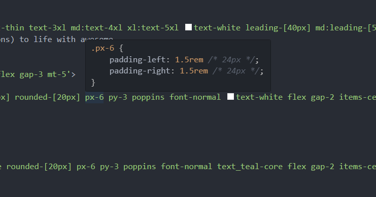 Image: tailwind css intellisense helping with viewing the css content of a tailwind utility class.
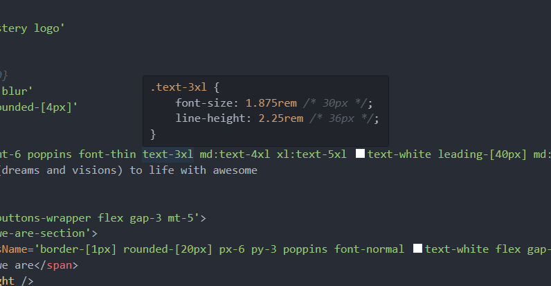 Image: tailwind css intellisense helping with viewing the css content of a tailwind utility class.
Guided by a '4-unit to 1 rem' space system(0.25rem or 4px per 1 unit) for measurement, and other relevant standards for colours, and other aspects, tailwind simplifies CSS by providing a class for everything(I hope I'm right) that you'll ever need to do with CSS.
To wrap it all up, and make you feel you're in dream land, tailwind perfectly handles media queries(a very critical aspect of styling and UI engineering that many struggle to implement) with simplicity and style - keeping everything inline.
With tailwind, all you need, is a single css file containing some declarations. Of course, you can still write custom CSS - if you wish.
It has become a go-to choice for many developers and teams looking to build modern, responsive user interfaces.
1
2  @tailwind base;
3  @tailwind components;
4  @tailwind utilities;
5
6  /* add your extra/custom CSS here */
7
8
Tailwind is designed to be highly customizable, allowing developers to create unique designs without having to write custom CSS. It promotes a workflow that encourages rapid prototyping and iteration, making it an excellent choice for both small projects and large-scale applications.
Tailwind also supports a mobile-first approach, enabling developers to build responsive designs that look great on all devices.
Its extensive documentation and community support make it easy for newcomers to get started and for experienced developers to find solutions to their challenges.
For me, this Nerdcave tailwind cheatsheet has been of immense help over time. It helps with quickly grasping the fundamentals of tailwind, while helping you get up to speed with using its utility classes as fast as possible.
Answers To Reasons Why You Would Want To Hate It.
Despite all the impressive features of tailwind, there are still reasons why some developers will seem to hate it, and say trash things about it. In this section, I'll be addressing some of these reasons, and providing answers to them.
1. "The utility classes just fill up space - it's odd having to write so much utility classes"
Answer: Such developers seem not to be aware of the @apply directive in Tailwind CSS. Simply use the @apply directive to extract repeated utility patterns into custom CSS classes.
1
2/* In your CSS file */
3
4.btn-primary {
5@apply py-2 px-4 bg-blue-500 text-white font-semibold rounded-lg shadow-md
6hover:bg-blue-700 focus:outline-none focus:ring-2 focus:ring-blue-400 focus:ring-opacity-75;
7}
8
Then in your HTML or JSX, you can simply use:
1
2<button class="btn-primary">Save changes</button>
3
Ensure to use the @apply keyword very carefully, as this might get you caught in the web of needing to overwrite classes that you create for repeating or custom components.
2. "It makes your HTML look messy and unreadable"
Answer: This is a valid concern initially, but considering modern approaches to UI development, this is not a problem any more. Most modern frameworks allow you to create reusable components, hiding complexity, and improving readability.
Alternatively, you can use the @apply directive as explained above.
1
2  // React component example
3
4  function PrimaryButton({ children }) {
5    return (
6      <button className='px-4 py-2 bg-blue-500 text-white rounded hover:bg-blue-600
7      focus:outline-none focus:ring-2'>
8        {children}
9      </button>
10    );
11  }
12
13  // Usage
14  <PrimaryButton>Click Me</PrimaryButton>;
15
16
3. "It doesn't follow separation of concerns - mixing presentation with content"
Answer: While traditional CSS promotes separation of files, Tailwind promotes separation of responsibilities. With component-based architectures, the component itself encapsulates both structure and styling, creating more maintainable, self-contained units. This actually results in less context switching and better developer experience.
For larger applications, you can still organize your styles as shown below, even though this(if not well managed), might defeat the profit of using Tailwind in the first place, since stacking or grouping classes will cause the need to make custom CSS overwrites for certain elements that are different.
1
2  // styles.js
3
4  export const buttonStyles =
5  'px-4 py-2 bg-blue-500 text-white rounded hover:bg-blue-600';
6
7  export const cardStyles =
8  'bg-white shadow-md rounded-lg p-4';
9
101
2 /* Button.jsx */
3 import { buttonStyles } from './styles';
4
5 function Button({ children }) {
6 return <button className={buttonStyles}>{children}</button>;
7 }
8
9Do well to avoid overuse of @apply and the itch to create custom component styles. Doing so might get you caught in the web of needing to overwrite classes that you create for repeating or custom components.;
In case you disagree with my opinion, with time, you'll get to see and appreciate tailwind just the way it is, and for the flexibility it provides when building user interfaces. Simply allow each element to have its own styling.
After all, your final output css will certainly get purged - ensuring that all the repeated classes are added only once into it.
4. "There's a steep learning curve with all those class names"
Answer: Tailwind's class names are actually quite intuitive once you understand the patterns:
p-4= padding: 1rem or padding: 16pxmt-2= margin-top: 0.5 or margin-top: 8pxtext-lg= font-size: 1.125rembg-blue-500= background-color: #3b82f6
As earlier stated:
- Tailwind uses a '4-unit to 1 rem' space system(0.25rem or 4px per 1 unit) for measurement.
- For sizes(e.g. font sizes and widths of media queries), it uses standard variants like sm, md, lg, and more.
- For colours, it uses a standard scale that starts from 50, and increments by 100 from the 100 point mark - for its selected custom colours.
- For co-ordinates, it simply uses the y and x axis. This means py-2 is a vertical(top and bottom) padding of 0.5rem(8px). It even handles effects like hover, and focus.
- For Media queries, simply call the class name with the prefix of the media query you want to use. For example, lg:mt-2 means a margin-top of 0.5rem(8px) on large screens and above. A regular class, say, mt-2 means a margin-top of 0.5rem(8px) on all screens, and md:mt-3 means a margin-top of 0.75rem(12px) on medium screens and above.
All these are reasons why tailwind is easy to grasp.
1
2  // React component example
3
4  function PrimaryButton({ children }) {
5    return (
6      <button className='px-4 py-2 bg-blue-500 text-gray-100 lg:text-gray-50 rounded
7      hover:bg-blue-600'>
8        {children}
9      </button>
10    );
11  }
12
13
Furthermore, Tailwind also supports custom values. This is an awesome feature that comes in handy a lot if you want some extra flexibility. To use this feature, simply add the desired value within square brackets.
1
2  // React component example
3
4  function PrimaryButton({ children }) {
5    return (
6      <button className='px-[22px] py-[3rem] bg-blue-500 text-gray-100
7       lg:text-gray-50 rounded-[17px] hover:bg-blue-600'>
8        {children}
9      </button>
10    );
11  }
12
13
Tailwind comes with a special and very customizable configuration(tailwind.config.js) file, that helps you set preferences like media query break-points, your content location, fonts, and more. This(tailwind.config.js) file is the standard configuration/setup file for all tailwind projects.
Below is a sample tailwind.config.js file that should work seamlessly for you. Feel free to copy-paste, and extend, and use in your projects.
1
2  import type { Config } from 'tailwindcss';
3
4  const config: Config = {
5    content: [
6    './pages/**/*.{js,ts,jsx,tsx,mdx}',
7    './components/**/*.{js,ts,jsx,tsx,mdx}',
8    './app/**/*.{js,ts,jsx,tsx,mdx}',
9    ],
10    theme: {
11    extend: {
12    // fontSize: {
13    // heading: ['48px', '64px', '36px', '24px', '18px', '16px'] // h1 to h6
14    // }
15    },
16    screens: {
17      xsm: '450px',
18      // => @media (min-width: 450px) { ... }
19
20      sm: '640px',
21      // => @media (min-width: 640px) { ... }
22
23      md: '768px',
24      // => @media (min-width: 770px) { ... }
25
26      lg: '1150px',
27      // => @media (min-width: 1150px) { ... }
28
29      xl: '1280px',
30      // => @media (min-width: 1280px) { ... }
31
32      '2xl': '1536px',
33      // => @media (min-width: 1536px) { ... }
34    },
35  },
36  // plugins: [],
37
38};
39
40export default config;
41
42
Tailwind's documentation is excellent, and tools like:
- The Tailwind CSS IntelliSense for VS Code.
- Third-party cheat sheets like this one by Creative Tim,
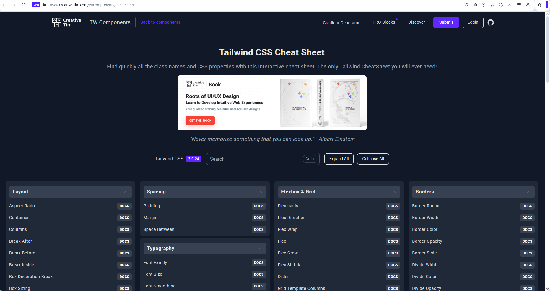 Image: a screenshot showing the tailwind cheatsheet
section on the creative tim website.
Image: a screenshot showing the tailwind cheatsheet
section on the creative tim website.
and this one on the Nerdcave website by Jay Elaraj.
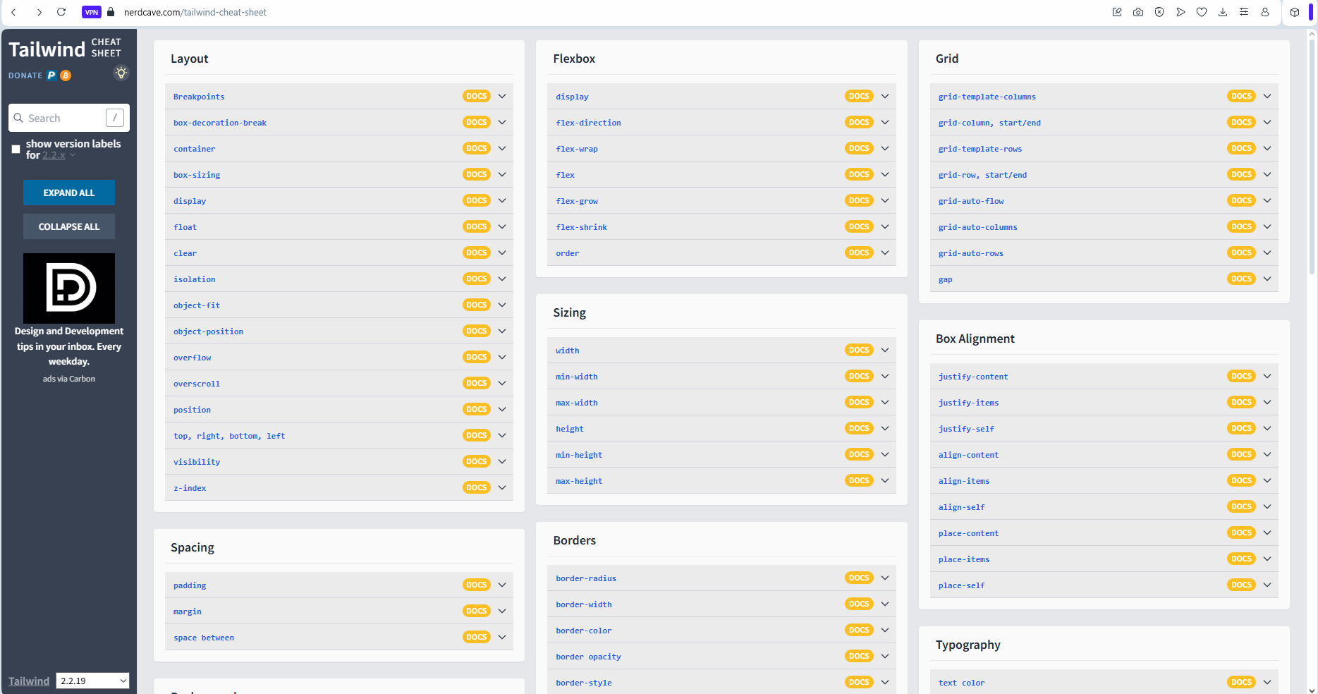 Image: a screenshot showing the tailwind cheatsheet section
on the nerdcave website.
Image: a screenshot showing the tailwind cheatsheet section
on the nerdcave website.
All help to flatten the learning curve significantly.
5. "It generates large CSS files"
Answer: This concern is outdated. In older versions, tailwind uses PurgeCSS to scan your files and remove unused classes. In Tailwind 3.0+, this is handled by default with JIT (Just-In-Time) mode, which only generates the CSS you actually use.
1
2  import type { Config } from 'tailwindcss';
3
4  const config: Config = {
5    content: [
6    './pages/**/*.{js,ts,jsx,tsx,mdx}',
7    './components/**/*.{js,ts,jsx,tsx,mdx}',
8    './app/**/*.{js,ts,jsx,tsx,mdx}',
9    ],
10
11   // remaining part of the config file...
12  };
13
14  export default config;
15
16
With this setup, production builds are typically very small, often under 10KB when gzipped.
6. "It's hard to customize and extend"
Answer: This couldn't be further from the truth. Tailwind is built for customization:
1
2 // tailwind.config.js
3   ...
4
5    theme: {
6      extend: {
7        colors: {
8          brand: '#FF4785',
9          'brand-dark': '#FF1A53',
10        },
11        spacing: {
12          72: '18rem',
13          84: '21rem',
14        },
15        borderRadius: {
16          xl: '1rem',
17        },
18        fontSize: {
19        'xxs': '0.625rem', // 10px
20        'huge': '5rem',    // 80px
21        },
22      },
23    },
24
25  ...
26
27
Usage:
1
2<section class="p-4 sm:p-72 bg-brand hover:bg-brand-dark text-white rounded-xl">
3  <h2 class="text-2xl mb-4">Welcome</h2>
4  <p>Thanks for using custom Tailwind values</p>
5  <p class="text-xxs">Tiny text</p>
6</section>
7
8
You can even create your own plugins:
1
2 // tailwind.config.js
3   ...
4
5    plugins: [
6      plugin(function ({ addUtilities }) {
7        const newUtilities = {
8          '.text-shadow-sm': {
9            textShadow: '0 1px 2px rgba(0, 0, 0, 0.05)',
10          },
11          '.text-shadow': {
12            textShadow: '0 2px 4px rgba(0, 0, 0, 0.1)',
13          },
14        };
15        addUtilities(newUtilities);
16      }),
17    ],
18
19  ...
20
21
What the plugin does:
It extends tailwind with two custom utility classes. Basically, you're manually injecting them into tailwind for use in your project.
Usage:
1
2<h2 class="text-2xl font-bold text-brand text-shadow-sm md:text-shadow">
3  Glowing Title
4</h2>
5
7. "It doesn't work well for larger teams"
Answer: Actually, Tailwind shines in larger teams for some good reasons:
- Consistent design system: Tailwind enforces a design system with predefined spacing, colors, and typography.
- Reduced conflicts: Less chance of CSS specificity wars and unexpected side effects.
- Standardized patterns: Teams develop consistent component patterns.
Many large companies including Netflix, Algolia, and Shopify use Tailwind in production with large development teams.
8. "Traditional CSS is more performant"
Answer: When properly configured, Tailwind can produce smaller CSS bundles than hand-written CSS. The JIT compiler ensures only the classes you use get included in your final bundle. Additionally, since all styles are inlined as classes, there's no need for the browser to parse complex CSS selectors.
For complex applications, Tailwind often results in better performance due to:
- Smaller file sizes after purging, and
- No unused CSS
9. "It only works on the web after all".
Answer: Tailwind's utility-first approach isn't limited to just web development. There are several adaptations and implementations for other platforms:
- React Native: Libraries like tailwind-rn and nativewind bring Tailwind's utility classes to React Native development.
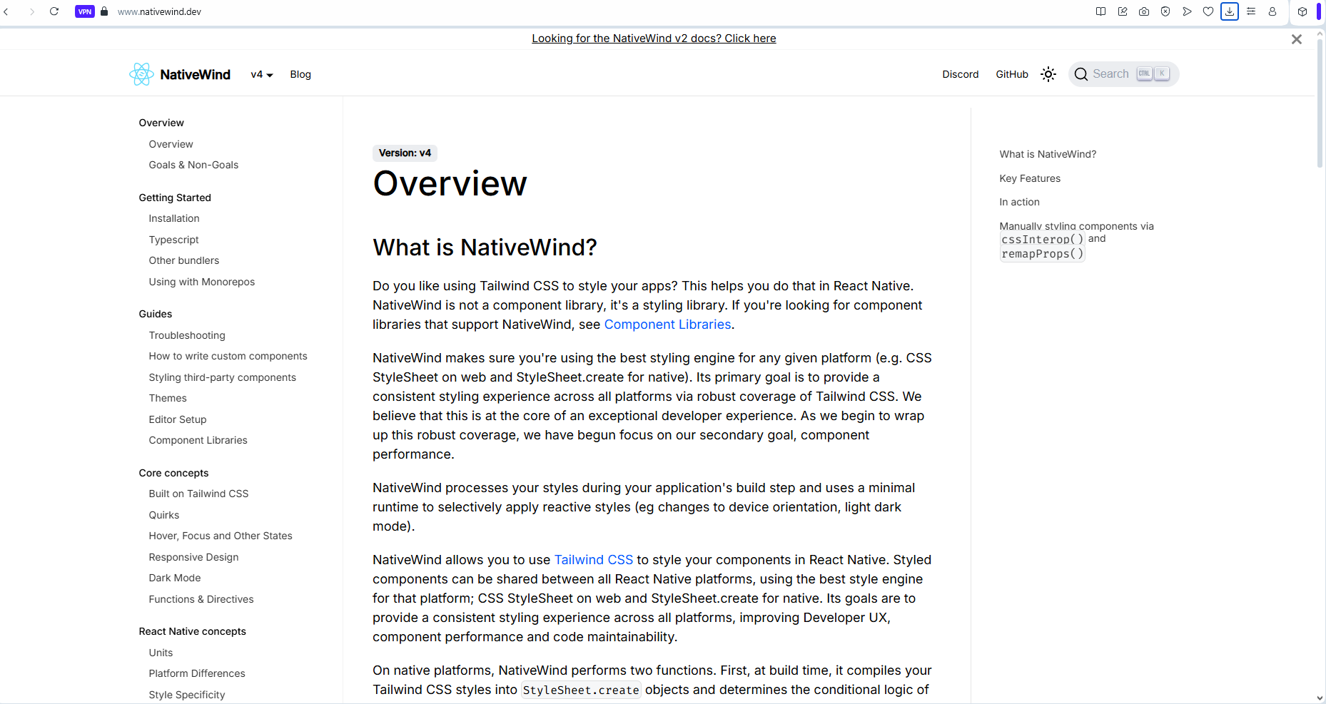 Image: a screenshot showing a section from the
nativewind website landing page.
Image: a screenshot showing a section from the
nativewind website landing page.
I've worked on multiple mobile app projects with nativewind and React Native. The experience is simply awesome.
-
Desktop Applications: Frameworks like Electron and Tauri can use Tailwind directly since they're web-based. I can't wait to try them out.
-
Even though I'm not very certain, my research showed the use of tailwind CSS in Flutter, with libraries like flutter_tailwind that bring Tailwind-like utilities to Flutter development.
The utility-first methodology that Tailwind pioneered has influenced styling approaches across multiple platforms and frameworks, showing its value beyond just web development.
Wrapping Up.
Pheeeew!!!
That was quite a lot, and thanks for reading thus far.
Writing this piece took quite a lot. But then its all worth it. While this piece was more about tailwind, I resolved to make it as value-packed as possible - sharing valuable information and insights along the way.
I do hope you learnt a lot, and now appreciate TailwindCSS for its beauty and perfection, and for how much improvement it has added to the experience of UI engineers all around the world.
Hire the Zed Labs Team - Let's bring your software and design projects to life.
We've still got project/client slots for this month.
We invite you to come hire us to build and deliver your software or design projects. Whether it's web, mobile, or a desktop platform project in any domain such as AI or Web3, we've got you covered. From MVPs, to large scale enterprise projects, we're open to having you on board, and making you a happy client. We look forward to collaborating with you!
-
If you would love to work with the team at Zed Labs and have us build awesome stuff for you, simply visit our website, and fill the contact form. Alternatively, you can send us an email here: hello.zedlabs@gmail.com.
-
You can also send me a private email at okpainmondrew@gmail.com or a DM via Linkedin - just in case you prefer to contact me directly.
We'll be excited to hop on a call and get on the way to bringing your software or design project to life.
Conclusion.
Even though the Zed Labs blog is new. We hope to make it a haven where top-level engineers come to read, learn and get inspired - through smashing articles/content like this one.
Do well to bookmark the Zed Labs blog, and stroll over to read new and exciting stories, plus top-notch mid-to-senior level engineering content in your free time.
If you loved this post or any other Zed Labs blog post, and would love to send an appreciation, simply use this link to buy us some cups of coffee 🤓.
Thanks for reading.
Cheers!!!